
Branding & Marketing with TWC
Cheers 🥂We're glad you've found your way here. Please fill in your details and let us know what services you're interested in THEN you'll be guided to book an inquiry call.
Cheers 🥂We're glad you've found your way here. Please fill in your details and let us know what services you're interested in THEN you'll be guided to book an inquiry call.
Cheers 🥂We're glad you've found your way here. Please fill in your details and let us know what services you're interested in THEN you'll be guided to book an inquiry call.
Cheers 🥂We're glad you've found your way here. Please fill in your details and let us know what services you're interested in THEN you'll be guided to book an inquiry call.
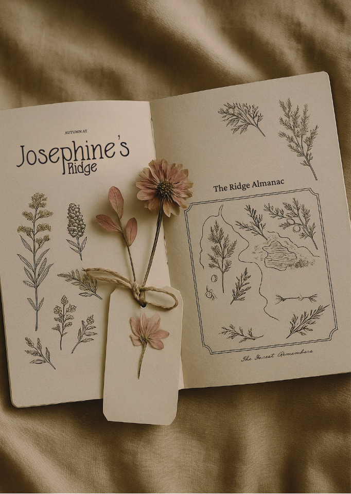
Josephine’s Ridge
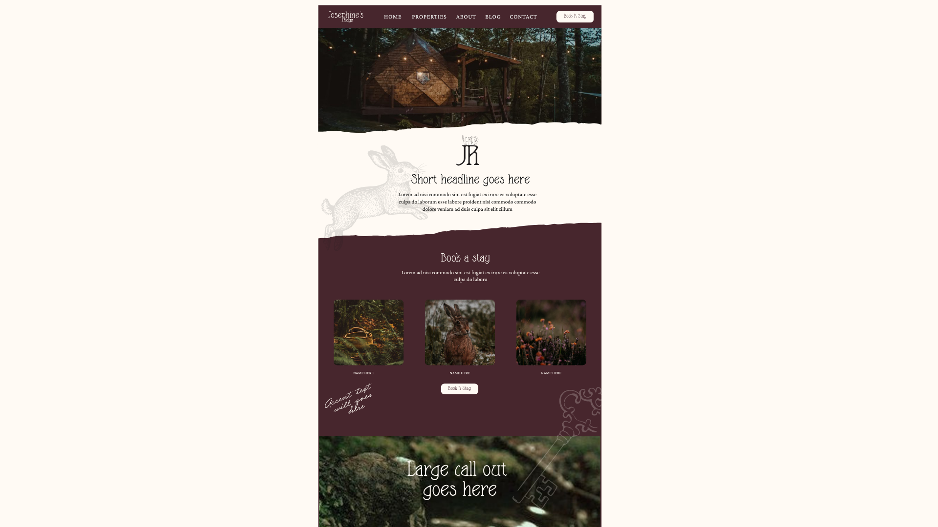
Josephine’s Ridge is a nature-rooted retreat tucked into the Gorge, designed for couples seeking calm, creativity, and connection. The property blends architecture, artistry, and nature into an immersive, storybook-inspired experience—where every stay feels like entering a new chapter of stillness and wonder.
.jpg)
The Challenge
the problem
The brand needed to capture a mood that was both enchanting and grounded—a balance between design-forward sophistication and nostalgic warmth. The goal was to create an identity that stood apart from traditional “luxury cabins” by feeling intimate, whimsical, and deeply tied to place. The challenge was to bring that sense of story and presence to life through words, visuals, and illustration.
What we did
Brand Naming
We named Josephine’s Ridge to feel personal and timeless—an invitation into a story rather than a structure. The name evokes character and emotion, grounded in the landscape while hinting at history, charm, and wonder.
Brand Positioning & Strategy
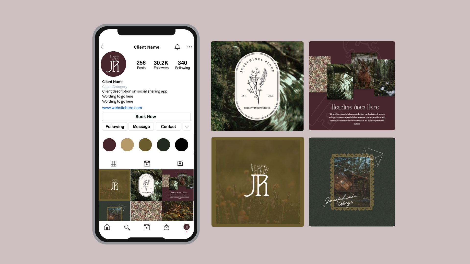
We positioned Josephine’s Ridge as the Gorge’s storybook retreat—where design and nature move in rhythm. The brand strategy centered on presence, creativity, and connection, building a foundation for a retreat that inspires calm and curiosity in equal measure.
Target Audience
We defined the core audience as design-minded couples and creatives seeking meaningful escapes. These travelers crave slowness, sensory experiences, and emotional connection over luxury excess. They’re drawn to spaces that feel curated, imaginative, and rooted in nature.
Core Messaging Framework
We crafted a messaging system built around the theme of “Escape the noise, enter the story.” Every phrase encourages guests to slow down and reconnect—mirroring the rhythm of the landscape. The tone blends warmth and whimsy with poetic restraint, making the brand feel like both a retreat and a reminder to breathe.
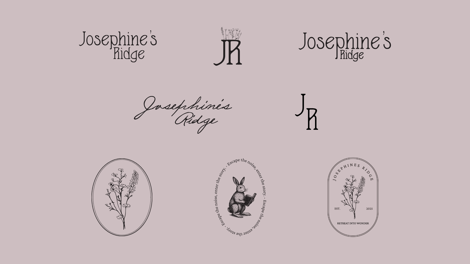
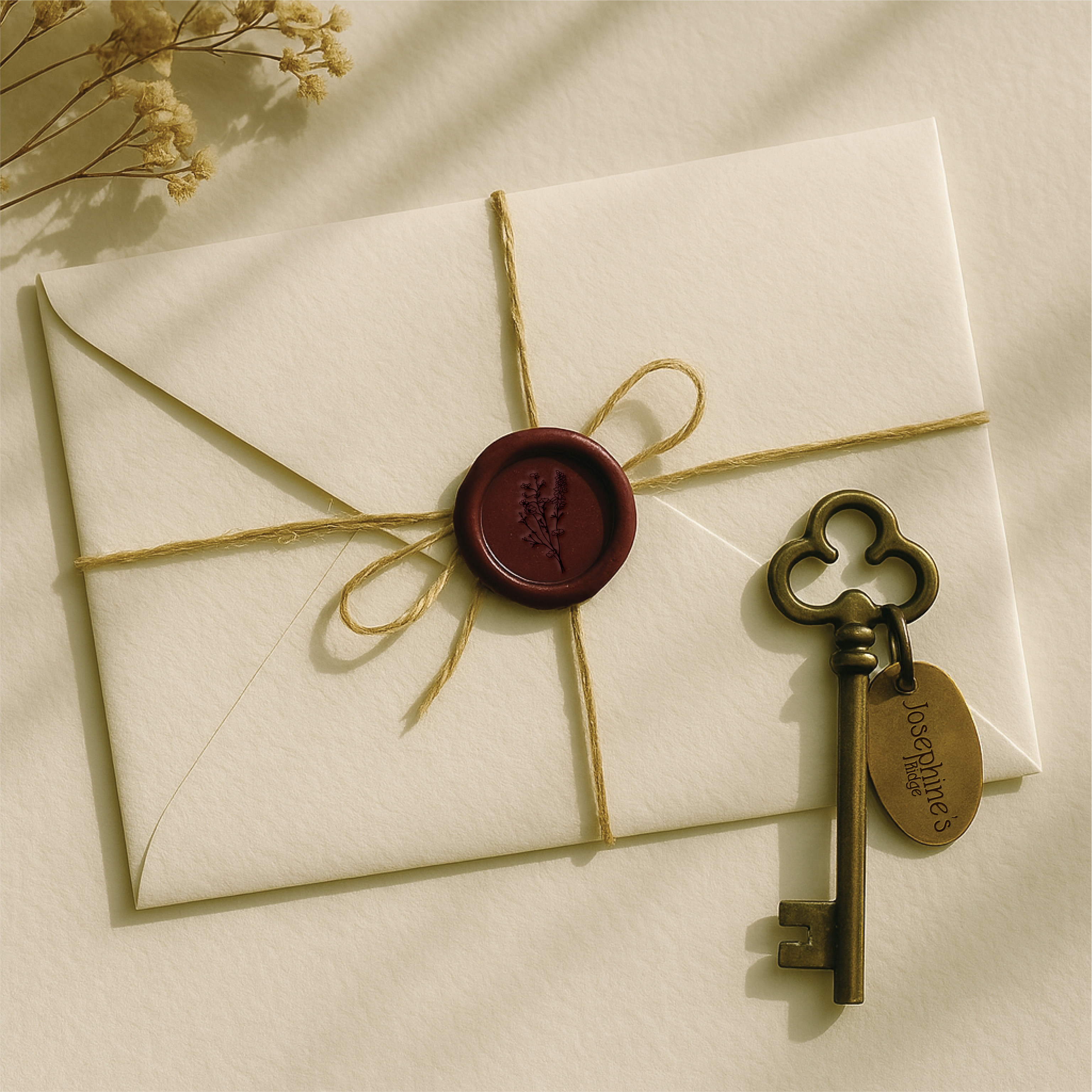
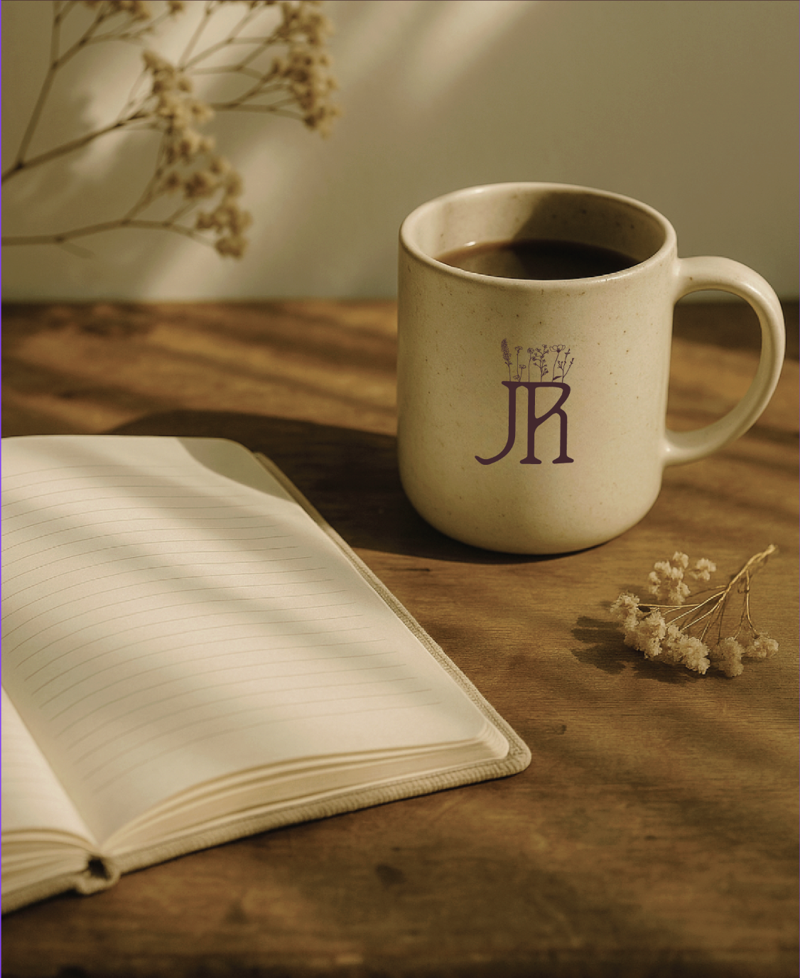
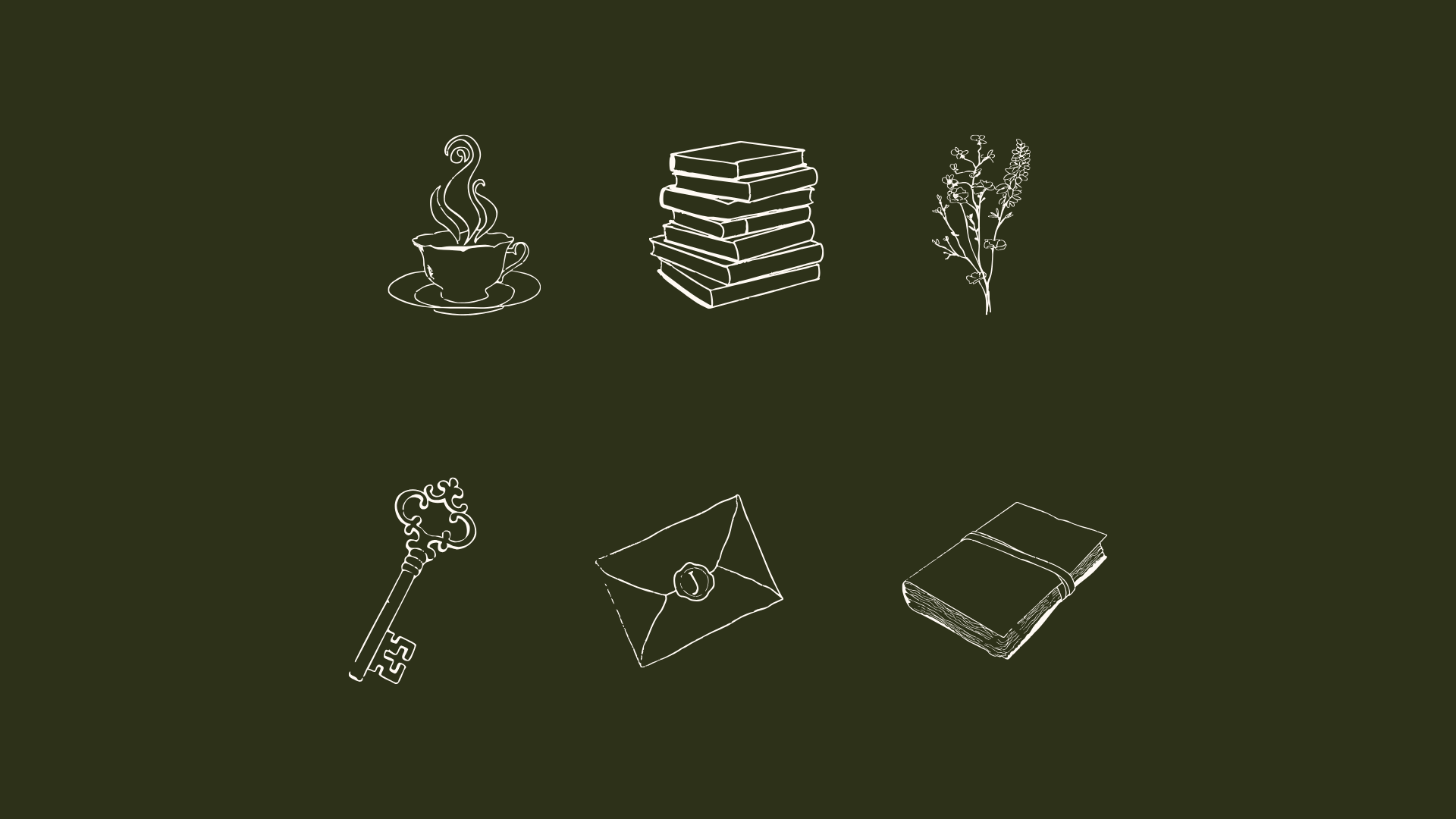
Brand Visuals
The visual identity pairs romantic serif and handwritten typefaces with delicate botanical linework and storybook-inspired illustrations. The rabbit motif symbolizes curiosity, wonder, and presence—appearing across monograms and badges. A muted palette of lavender-gray and woodland green creates a moody, timeless atmosphere. The result is a brand that feels both nostalgic and new—rooted in design, guided by story.

The Results
- Established a brand identity that feels intimate, whimsical, and distinct within the luxury retreat market
- Created a cohesive system of messaging, visuals, and illustration that invites guests into a story rather than a stay
- Designed a visual language adaptable across signage, packaging, and digital touchpoints
- Received enthusiastic client feedback for perfectly capturing the property’s “storybook serenity” and emotional depth
Ready To Work Together?
Ready to stand out, connect with your audience, and see results?
Let’s bring your brand to life on social media.