
Branding & Marketing with TWC
Cheers 🥂We're glad you've found your way here. Please fill in your details and let us know what services you're interested in THEN you'll be guided to book an inquiry call.
Cheers 🥂We're glad you've found your way here. Please fill in your details and let us know what services you're interested in THEN you'll be guided to book an inquiry call.
Cheers 🥂We're glad you've found your way here. Please fill in your details and let us know what services you're interested in THEN you'll be guided to book an inquiry call.
Cheers 🥂We're glad you've found your way here. Please fill in your details and let us know what services you're interested in THEN you'll be guided to book an inquiry call.
Timber Coast Escapes
Timber Coast Escapes offers elevated cabin stays across Michigan—designed for every season and rooted in the state’s natural beauty. With a growing collection of lakeside and forest properties, the brand focuses on thoughtful design, simplicity, and connection, creating destinations where guests can truly unwind.

The Challenge
the problem
Before the rebrand, Timber Coast lacked a cohesive identity to unite its expanding collection of cabins. The existing look didn’t capture the brand’s balance of adventure and calm, or its all-season appeal. The challenge was to build a flexible system that could grow with new locations—grounded in nature, elevated in design, and instantly recognizable across every touchpoint.
What we did
Brand Naming
We named Timber Coast Escapes to reflect the harmony of Michigan’s landscapes—where dense forests meet freshwater coastlines. The name conveys both strength and serenity, embodying the brand’s essence: design-forward escapes rooted in nature and connection.
Brand Positioning & Strategy
We positioned Timber Coast Escapes as Michigan’s go-to name for elevated, all-season cabin experiences—where design, comfort, and nature coexist effortlessly. The strategy focused on building a brand that feels approachable yet refined, inviting guests to explore without complication and rest without compromise.
Target Audience
We identified travelers who value meaningful connection and simplicity—couples, families, and friend groups who see travel as a way to slow down and reconnect. They seek spaces that balance beauty and function, offering the comfort of home with the serenity of nature, no matter the season.
Core Messaging Framework
We built a messaging framework centered on ease, design, and presence. The tone is warm, grounded, and calm—encouraging guests to pause, breathe, and feel at peace. Every word reflects the brand’s promise: an escape for every season, where thoughtful hospitality meets natural wonder.
The Guest Experience
Guests arrive to fully stocked, design-forward cabins that make travel feel effortless. Days unfold at their own pace—coffee on the deck, lake swims, local hikes, or quiet afternoons by the fire. Nights end under the stars, sharing stories around the firepit. Every detail says: you can just show up, and everything’s taken care of.
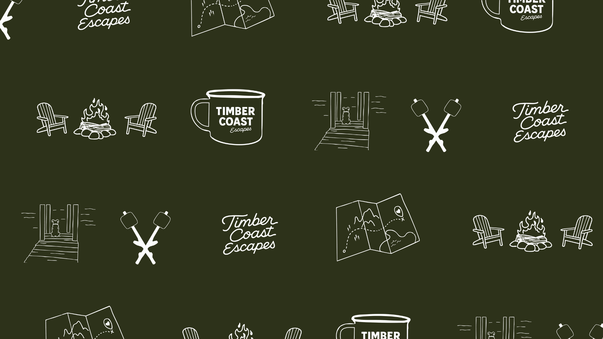
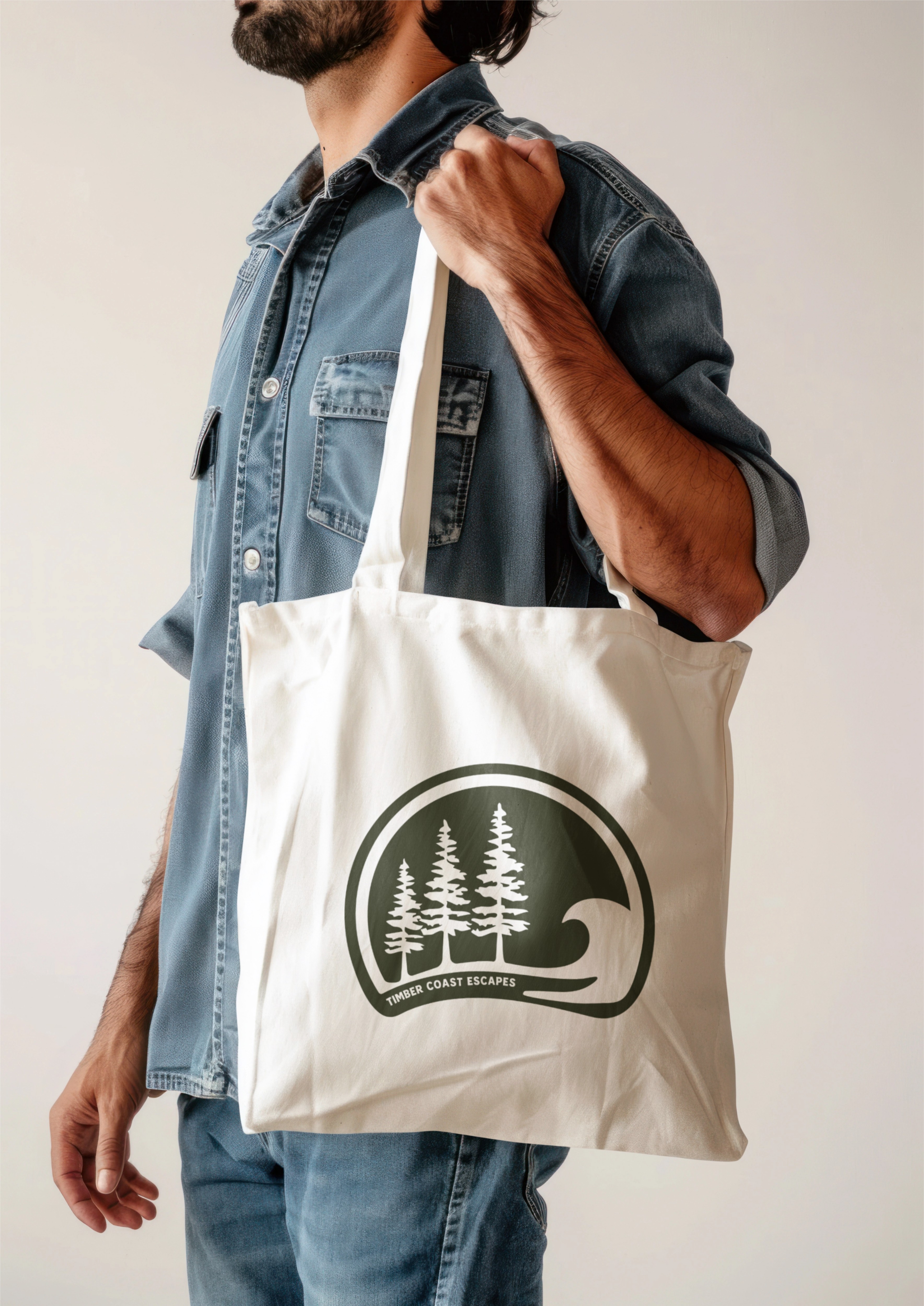
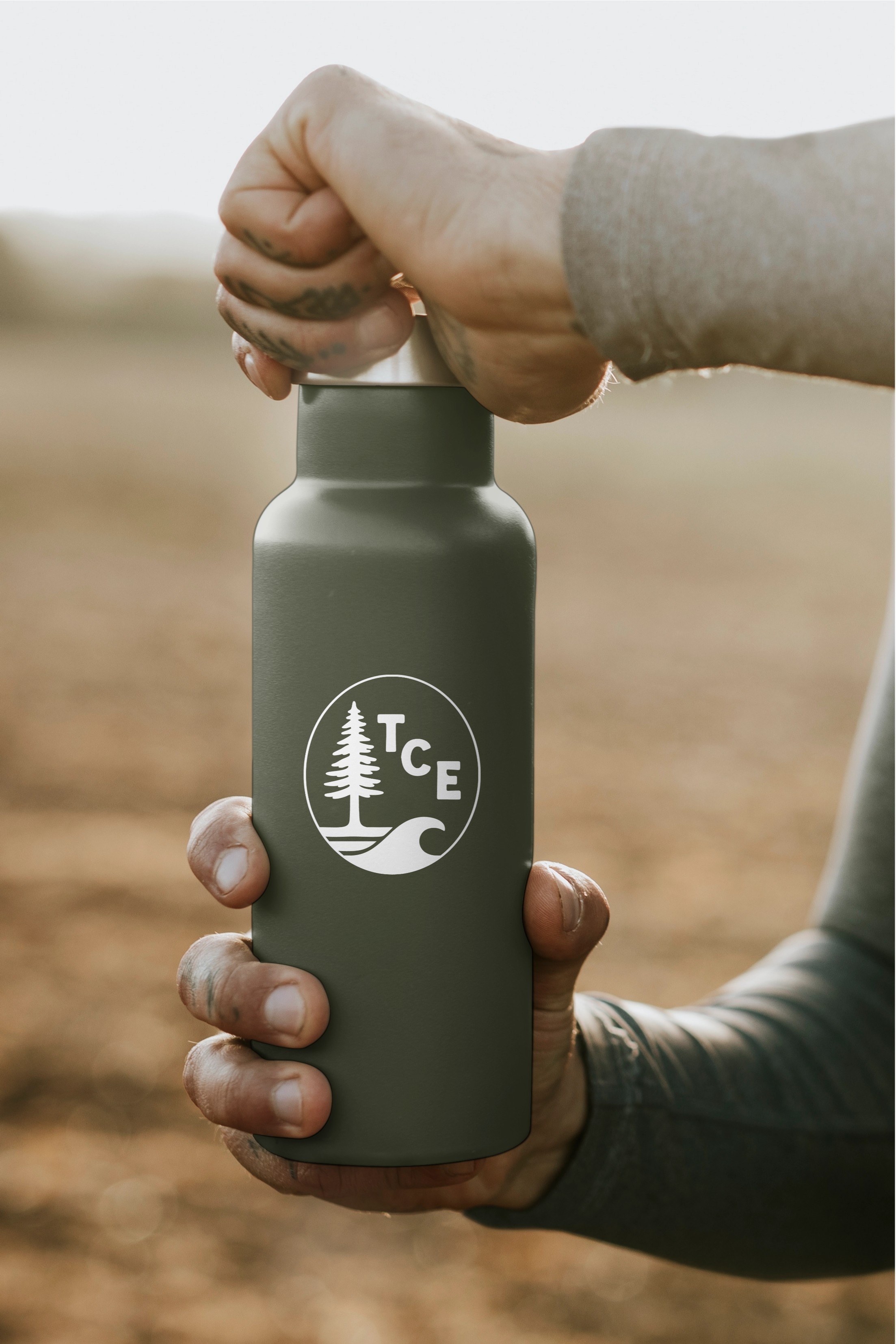
Brand Visual Identity
The visual identity celebrates Michigan’s rugged beauty through a system of versatile marks—each designed to flex across digital, print, and property applications. The logo suite features bold sans-serif typography paired with a friendly script, balancing structure with warmth. Iconic badges and monograms reflect the brand’s all-season spirit—equal parts coastal adventure and cozy retreat. A grounded color palette of forest green, sand, and off-white ties every element together, evoking the calm of nature and the ease of escape.

.png)


The Results
- Unified multiple Michigan properties under one cohesive brand identity
- Built a flexible system adaptable to future cabin launches and micro-resorts
- Established a clear voice and visual language that convey all-season serenity
- Created a logo suite and tagline that have become instantly recognizable across signage, print, and digital touchpoints
- Helped position Timber Coast Escapes as a leading name in Michigan’s boutique hospitality space
Ready To Work Together?
Ready to stand out, connect with your audience, and see results?
Let’s bring your brand to life on social media.