
Branding & Marketing with TWC
Cheers 🥂We're glad you've found your way here. Please fill in your details and let us know what services you're interested in THEN you'll be guided to book an inquiry call.
Cheers 🥂We're glad you've found your way here. Please fill in your details and let us know what services you're interested in THEN you'll be guided to book an inquiry call.
Cheers 🥂We're glad you've found your way here. Please fill in your details and let us know what services you're interested in THEN you'll be guided to book an inquiry call.
Cheers 🥂We're glad you've found your way here. Please fill in your details and let us know what services you're interested in THEN you'll be guided to book an inquiry call.
Willow Falls Resort
Willow Falls is a high-end landscape resort in Blue Ridge, Georgia, designed for couples, weddings, and small retreats. Centered around a private lake and cascading waterfalls, the property blends architectural beauty with natural serenity. With a mix of treehouse cabins, A-frames, and lakeside lodges, Willow Falls offers an immersive, design-forward experience for travelers seeking balance, romance, and connection in nature.

The Challenge
the problem
Before the rebrand, Willow Falls lacked a cohesive identity to match the property’s vision. The resort’s natural beauty and architectural design were stunning, but there was no unified story or visual language tying it all together. The owners needed a brand that could feel both luxurious and approachable—something that resonated with design-minded couples seeking meaningful experiences, not just a place to stay. The challenge was to capture that balance of epic and peaceful—a brand that could flex across weddings, retreats, and romantic getaways while staying timeless, grounded, and unmistakably Willow Falls.
What we did
Brand Positioning & Strategy
We refined Willow Falls’ brand positioning to reflect the balance of epic design and effortless peace. Built around nature, connection, and serenity, the brand was crafted to feel timeless and editorial—an elevated reflection of the property’s lakes, waterfalls, and wooded landscapes.
Target Audience
We identified core guest segments—Millennial and Gen Z couples, destination wedding planners, and creative professionals—and uncovered the shared desire for experiences that feel both inspiring and restorative. These insights guided every creative decision, from tone of voice to visual storytelling.
Core Messaging Framework
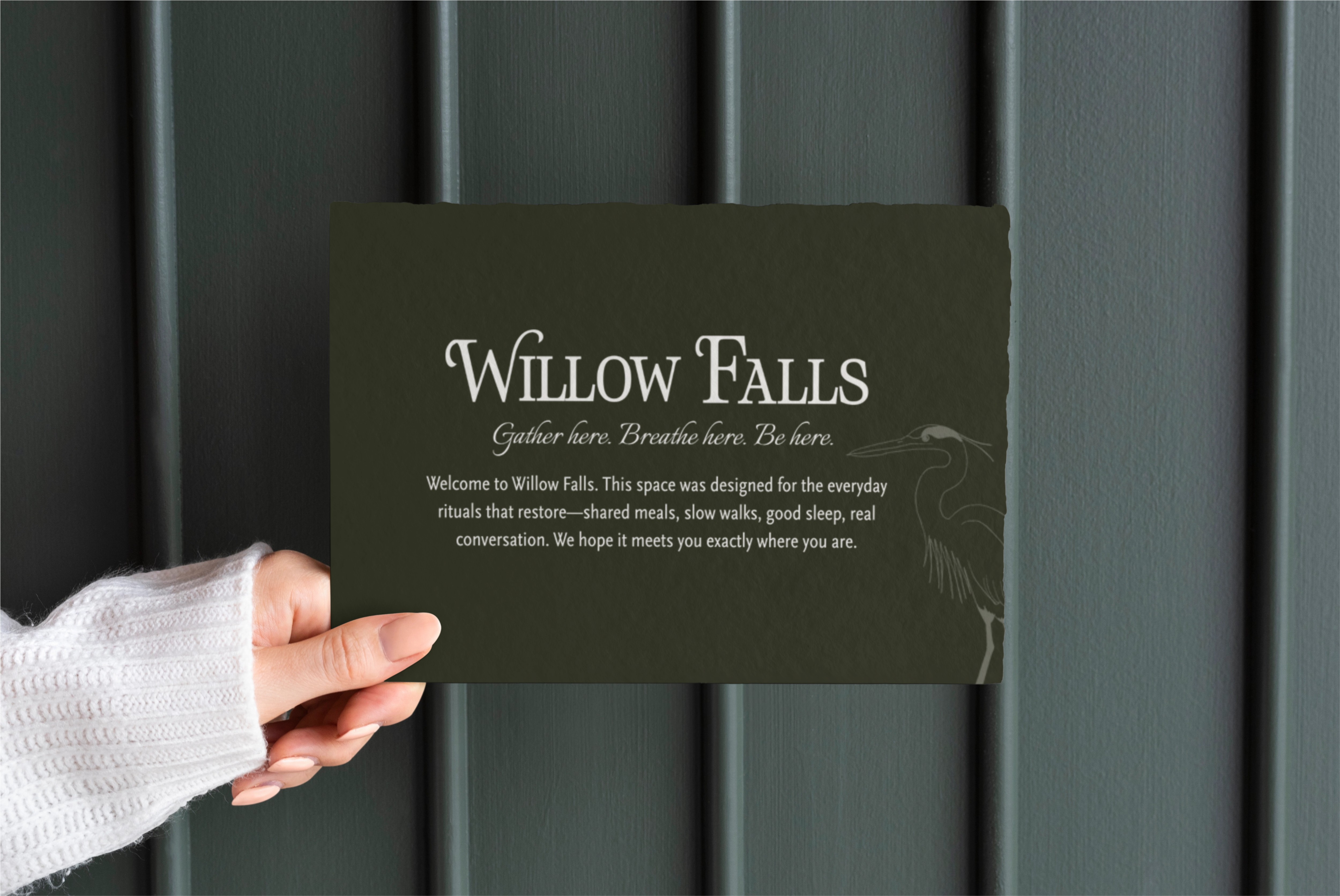
We built a full messaging system that centers on connection—to nature, to self, and to one another. From the mission statement to the brand pillars and tagline, every element was written to evoke calm, romance, and intention—inviting guests to slow down and rediscover balance.
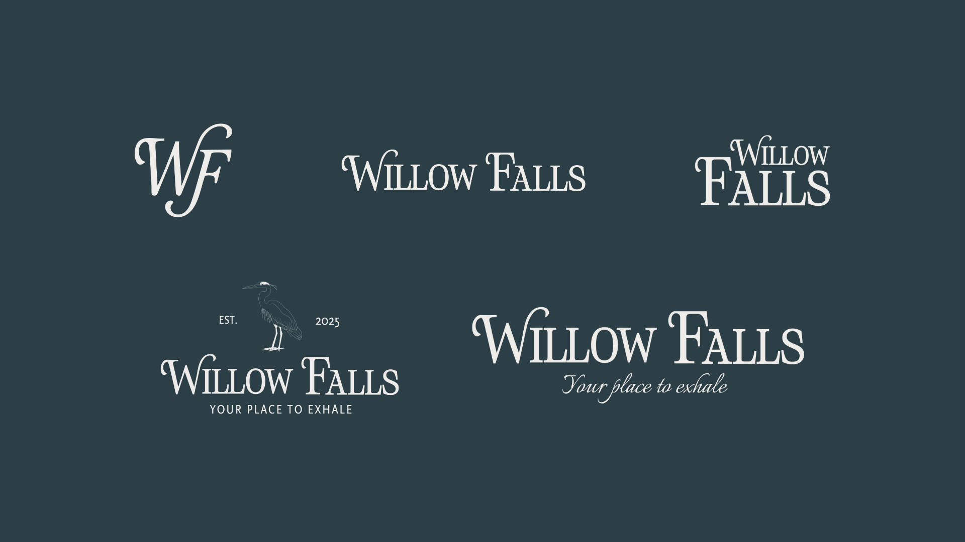
Brand Visual Identity
The visual identity blends natural textures with refined simplicity. A custom wordmark and monogram flow with the rhythm of falling water, while a minimalist bird illustration becomes the brand’s signature mark—symbolizing freedom, presence, and the quiet magic of nature in motion. Paired with a palette of soft greens, stone neutrals, and misty blues, the system feels modern, romantic, and distinctly Willow Falls.


The Results
The Results
- Defined a premium, emotionally resonant brand foundation that differentiates Willow Falls in the Blue Ridge market
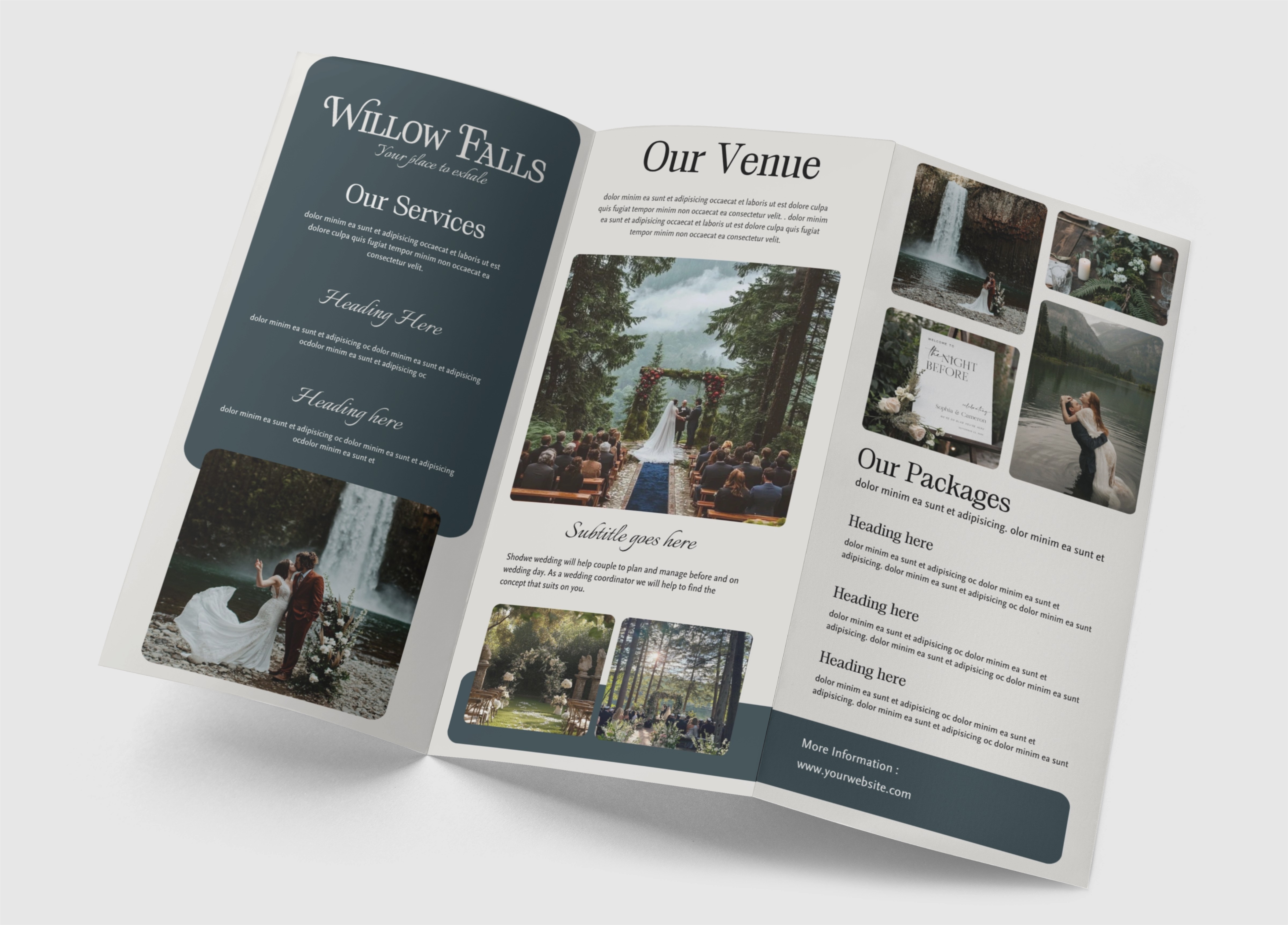
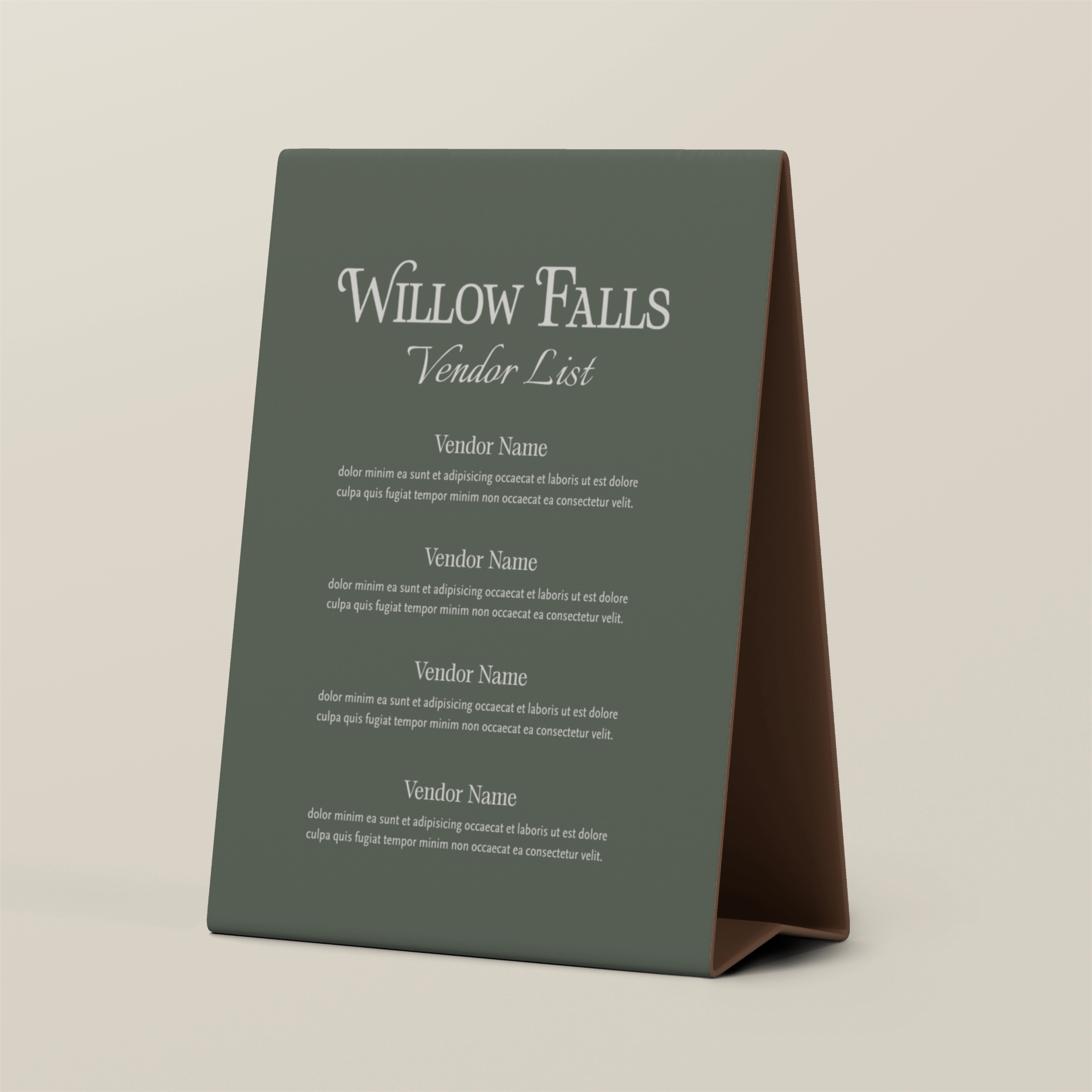
- Delivered a cohesive visual identity that translates seamlessly across web, signage, and print collateral
- Positioned the resort as a top-of-mind destination for romantic getaways and nature-immersed weddings
- Created storytelling and imagery direction that inspire editorial-style photography and guest engagement
- Received enthusiastic feedback from ownership and creative partners—described as “exactly the elevated yet peaceful feeling we wanted guests to feel”
The Results
The Results
- Defined a premium, emotionally resonant brand foundation that differentiates Willow Falls in the Blue Ridge market
- Delivered a cohesive visual identity that translates seamlessly across web, signage, and print collateral
- Positioned the resort as a top-of-mind destination for romantic getaways and nature-immersed weddings
- Created storytelling and imagery direction that inspire editorial-style photography and guest engagement
- Received enthusiastic feedback from ownership and creative partners—described as “exactly the elevated yet peaceful feeling we wanted guests to feel”
Ready To Work Together?
Ready to stand out, connect with your audience, and see results?
Let’s bring your brand to life on social media.